Theming
Choose from a variety of themes or develop your own theme easily.
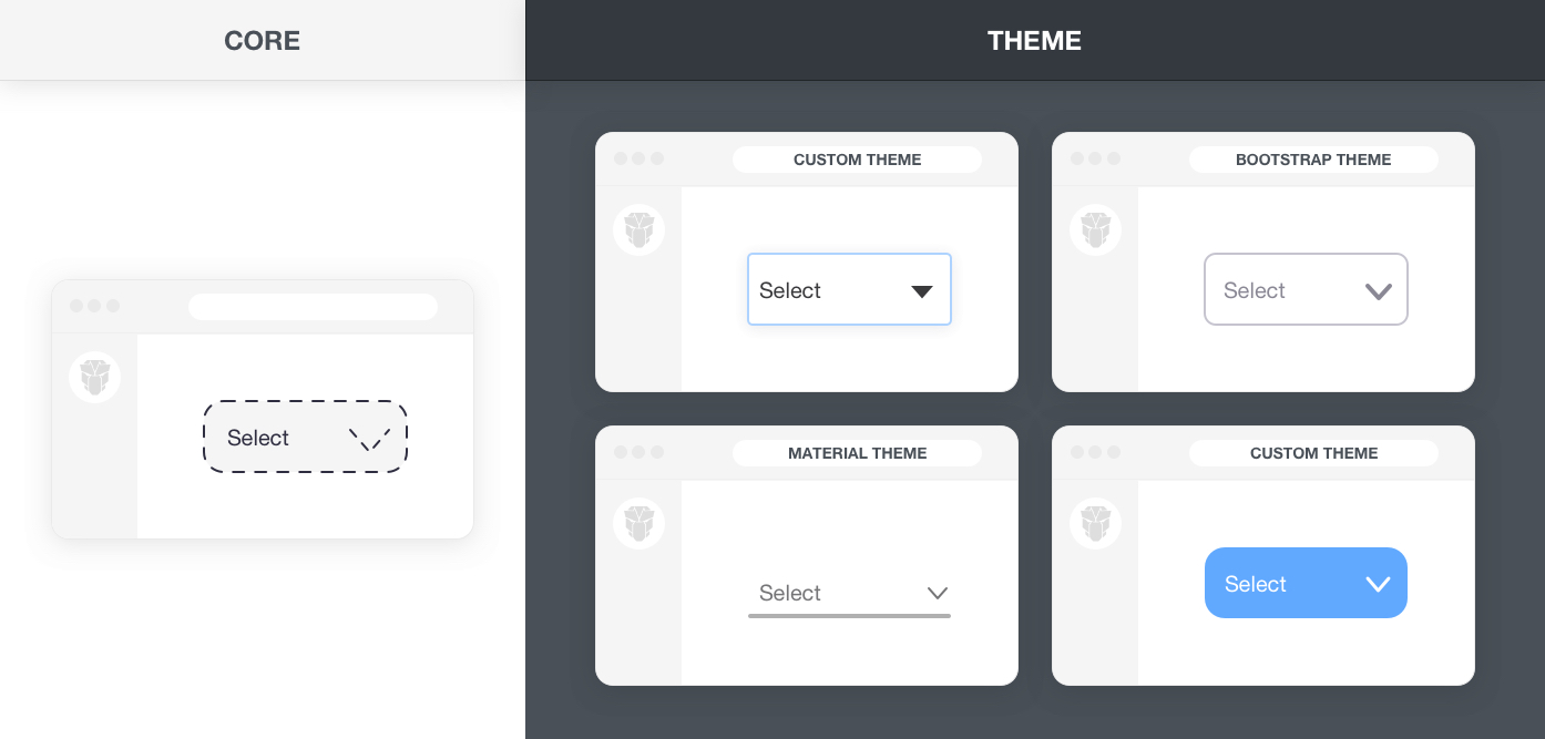
Architecture #
Note: PrimeVue v4 has a brand new styled mode implementation, visit the v4 documentation for more information.
PrimeVue is a design agnostic library so unlike other UI libraries it does not enforce a certain styling such as material or bootstrap. In order to achieve this, styling has been separated into two parts, core and theme. The core resides inside PrimeVue to implement the structure of the components such as positioning whereas theme brings the colors and spacing.
Built-in Themes #
PrimeVue ships with various free themes to choose from. The list below states all the available themes in the npm distribution with import paths. For a live preview, use the configurator at the topbar to switch themes.
primevue/resources/themes/md-light-indigo/theme.css
primevue/resources/themes/md-light-deeppurple/theme.css
primevue/resources/themes/md-dark-indigo/theme.css
primevue/resources/themes/md-dark-deeppurple/theme.css
primevue/resources/themes/mdc-light-indigo/theme.css
primevue/resources/themes/mdc-light-deeppurple/theme.css
primevue/resources/themes/mdc-dark-indigo/theme.css
primevue/resources/themes/mdc-dark-deeppurple/theme.css
primevue/resources/themes/aura-light-blue/theme.css
primevue/resources/themes/aura-light-indigo/theme.css
primevue/resources/themes/aura-light-purple/theme.css
primevue/resources/themes/aura-light-teal/theme.css
primevue/resources/themes/aura-light-green/theme.css
primevue/resources/themes/aura-light-amber/theme.css
primevue/resources/themes/aura-light-cyan/theme.css
primevue/resources/themes/aura-light-pink/theme.css
primevue/resources/themes/aura-light-lime/theme.css
primevue/resources/themes/aura-light-noir/theme.css
primevue/resources/themes/aura-dark-blue/theme.css
primevue/resources/themes/aura-dark-indigo/theme.css
primevue/resources/themes/aura-dark-purple/theme.css
primevue/resources/themes/aura-dark-teal/theme.css
primevue/resources/themes/aura-dark-green/theme.css
primevue/resources/themes/aura-dark-amber/theme.css
primevue/resources/themes/aura-dark-cyan/theme.css
primevue/resources/themes/aura-dark-pink/theme.css
primevue/resources/themes/aura-dark-lime/theme.css
primevue/resources/themes/aura-dark-noir/theme.css
primevue/resources/themes/lara-light-blue/theme.css
primevue/resources/themes/lara-light-indigo/theme.css
primevue/resources/themes/lara-light-purple/theme.css
primevue/resources/themes/lara-light-teal/theme.css
primevue/resources/themes/lara-light-green/theme.css
primevue/resources/themes/lara-light-amber/theme.css
primevue/resources/themes/lara-light-cyan/theme.css
primevue/resources/themes/lara-light-pink/theme.css
primevue/resources/themes/lara-dark-blue/theme.css
primevue/resources/themes/lara-dark-indigo/theme.css
primevue/resources/themes/lara-dark-purple/theme.css
primevue/resources/themes/lara-dark-teal/theme.css
primevue/resources/themes/lara-dark-green/theme.css
primevue/resources/themes/lara-dark-amber/theme.css
primevue/resources/themes/lara-dark-cyan/theme.css
primevue/resources/themes/lara-dark-pink/theme.css
Switch Themes #
Solution below works however there is room for improvement. The upcoming styling api will greatly improve dynamic theme switching ability, eliminates the prerequisites with the introduction of CSS variables and dynamic imports.
Themes can be dynamically changed using the PrimeVue.changeTheme function. For this feature to work, there are two prerequisites. To begin with, the themes should be publicly available under the public folder in your project by copying them from PrimeVue resources/themes folder. Second part is making the theme.css accessible via a link element so that the id of the link can be provided as the 3rd parameter to the changeTheme function.
primevue.changeTheme(currentTheme: string, newTheme: string, linkElementId: string, callback: Function)
// Options API
this.$primevue.changeTheme('md-dark-indigo', 'md-light-indigo', 'theme-link', () => {});
// Composition API
import { usePrimeVue } from 'primevue/config';

const PrimeVue = usePrimeVue();
PrimeVue.changeTheme('md-dark-indigo', 'md-light-indigo', 'theme-link', () => {});
In a Vite based project like create-vue, the link can be placed at index.html.
<link id="theme-link" rel="stylesheet" href="/themes/aura-light-green/theme.css">
Nuxt applications can configure the link element using nuxt.config.js.
export default defineNuxtConfig({
    app: {
        head: {
            link: [
                {
                    id: 'theme-link',
                    rel: 'stylesheet',
                    href: baseUrl + 'themes/aura-light-green/theme.css'
                }
            ]
        }
    }
});
Custom Theme #
Themes are created with SASS using the primevue-sass-theme project available at github. This repository contains all the scss files for the components and the variables of the built-in themes so that you may customize an existing theme or create your own. The scss variables used in a theme are available at the SASS API documentation.
There are 2 alternatives to create your own theme. First option is compiling a theme with command line sass whereas second option is embedding scss files within your project to let your build environment do the compilation. In all cases, the generated theme file should be imported to your project.
Theme SCSS
The theme scss is available as open source at primevue-sass-theme repository. The theme-base folder contains the theming structure of the components, themes under themes folder import the base and define the SCSS variables. The themes folder also contains all the built-in themes so you can customize their code as well.
To create your own theme, download the release matching your PrimeVue version and access the themes/mytheme folder. The sass variables to customize are available under the variables folder. The _fonts file can be used to define a custom font for your project whereas the optional _extensions file is provided to add overrides to the components designs. The theme.scss file imports the theme files along with the theme-base folder at the root to combine everything together. Next step would be compilation of the scss that can either be command line or within your project.
Compile SCSS Manually
Once your theme is ready run the following command to compile it. Note that sass command should be available in your terminal.
sass --update themes/mytheme/theme.scss:themes/mytheme/theme.css
Then copy and import the theme.css file in your application. For example, in a Vite based template like create-vue, you may place theme.css under assets folder and then import it an main.js.
import './assets/theme.css';
Build Time Compilation
This approach eliminates the manual compilation by delegating it to your build environment that has the ability to compile SCSS. Copy the theme-base folder along with themes/mytheme folder to your application where assets reside. At a suitable location like main.js or App.vue, import the theme.scss from assets/themes/mytheme. That would be it, during build time, your project will compile the sass and import the theme. Any changes to your theme will be reflected instantly.
Scoped CSS #
Scoped CSS allows overriding the styles of a particular PrimeVue component using scoped SFC style and :deep.
Lorem ipsum dolor sit amet, consectetur adipiscing elit, sed do eiusmod tempor incididunt ut labore et dolore magna aliqua. Ut enim ad minim veniam, quis nostrud exercitation ullamco laboris nisi ut aliquip ex ea commodo consequat. Duis aute irure dolor in reprehenderit in voluptate velit esse cillum dolore eu fugiat nulla pariatur. Excepteur sint occaecat cupidatat non proident, sunt in culpa qui officia deserunt mollit anim id est laborum.
<style scoped>
:deep(.p-panel .p-panel-header) {
    background-color: var(--teal-500);
    border-color: var(--teal-500);
    color: #ffffff;
}

:deep(.p-panel .p-panel-content) {
    border-color: var(--teal-500);
}
</style>
<template>
    <Panel header="Scoped Panel">
        <p>Lorem ipsum dolor sit amet, consectetur adipiscing elit, sed do eiusmod tempor incididunt ut labore et dolore magna aliqua.
            Ut enim ad minim veniam, quis nostrud exercitation ullamco laboris nisi ut aliquip ex ea commodo consequat.
            Duis aute irure dolor in reprehenderit in voluptate velit esse cillum dolore eu fugiat nulla pariatur. Excepteur sint occaecat
            cupidatat non proident, sunt in culpa qui officia deserunt mollit anim id est laborum.</p>
    </Panel>
</template>
CSS Modules #
CSS modules are supported by enabling the module property on a style element within your component and using the $style keyword to apply classes to a PrimeVue component.
<style module>
.myinput {
    border-radius: 2rem;
    padding: 1rem 2rem;
    border-width: 2px;
}
</style>
<template>
    <InputText :class="$style.myinput" placeholder="Search" />
</template>
An in-depth video tutorial is available to cover advanced uses cases with Pass Through props.
Scale #
PrimeVue utilizes rem units to make sure the components blend in with the rest of your UI perfectly. This also enables scaling, for example changing the size of the components is easy as configuring the font size of your document. Code below sets the scale of the components based on 16px. If you require bigger or smaller components, just change this variable and components will scale accordingly.
html {
    font-size: 14px;
}
PrimeFlex #
PrimeFlex is a lightweight responsive CSS utility library to accompany Prime UI libraries and static webpages as well. PrimeVue can be used with any CSS utility library like bootstrap and tailwind however PrimeFlex has benefits like integration with PrimeVue themes using CSS variables so that colors classes e.g. bg-blue-500 receive the color code from the PrimeVue theme being used. PrimeVue follows the CSS utility approach of PrimeFlex and currently does not provide an extended style property like sx. Same approach is also utilized in PrimeBlocks for PrimeVue project as well.
Here is an example to demonstrate how to align 3 buttons horizontally on bigger screens and display them as stacked on smaller ones.
<div class="flex flex-column md:flex-row md:justify-content-between row-gap-3">
    <Button type="button" label="Button 1"></Button>
    <Button type="button" label="Button 2" severity="secondary"></Button>
    <Button type="button" label="Button 3" severity="help"></Button>
</div>
Utils #
In addition to PrimeFlex, PrimeVue has a couple of css utility classes on its own as well.
| Name | Description |
|---|---|
| p-component | Applies component theming such as font-family and font-size to an element. |
| p-fluid | Applies 100% width to all descendant components. |
| p-disabled | Applies an opacity to display as disabled. |
| p-sr-only | Element becomes visually hidden however accessibility is still available. |
| p-reset | Resets the browsers defaults. |
| p-link | Renders a button as a link. |
| p-error | Indicates an error text. |
| p-invalid | Applies the invalid style to a text or a form field. |
CSS Variables #
Each PrimeVue theme exports numerous CSS variables, refer to Colors page for more details.