Designer
Theme Designer is the ultimate tool to customize and design your own themes featuring a visual editor, Figma to theme code, cloud storage, and migration assistant.
Overview #
The theming api is open and source freely available with an extensive documentation. Theme Designer is a tool build on top of this theming api with important features to make theming easier. Designer consists of 4 key features; The visual editor provides a UI to edit the complete set of tokens. The Figma to theme code generator is extremely useful to automate the design to code process and integrates seamlessly with the Figma UI Kit. The themes are saved in the cloud storage to be accessible from anywhere and any device and finally the migration assistant automatically updates your themes to the latest library version.
License #
A license key is required to be able to use all the services provided by the designer. Without a license, the visual editor is still available for trial purposes with various options such as downloads, and cloud storage disabled. The license key can be purchased at PrimeStore, it is valid for 1 year and needs to be renewed manually after a year.
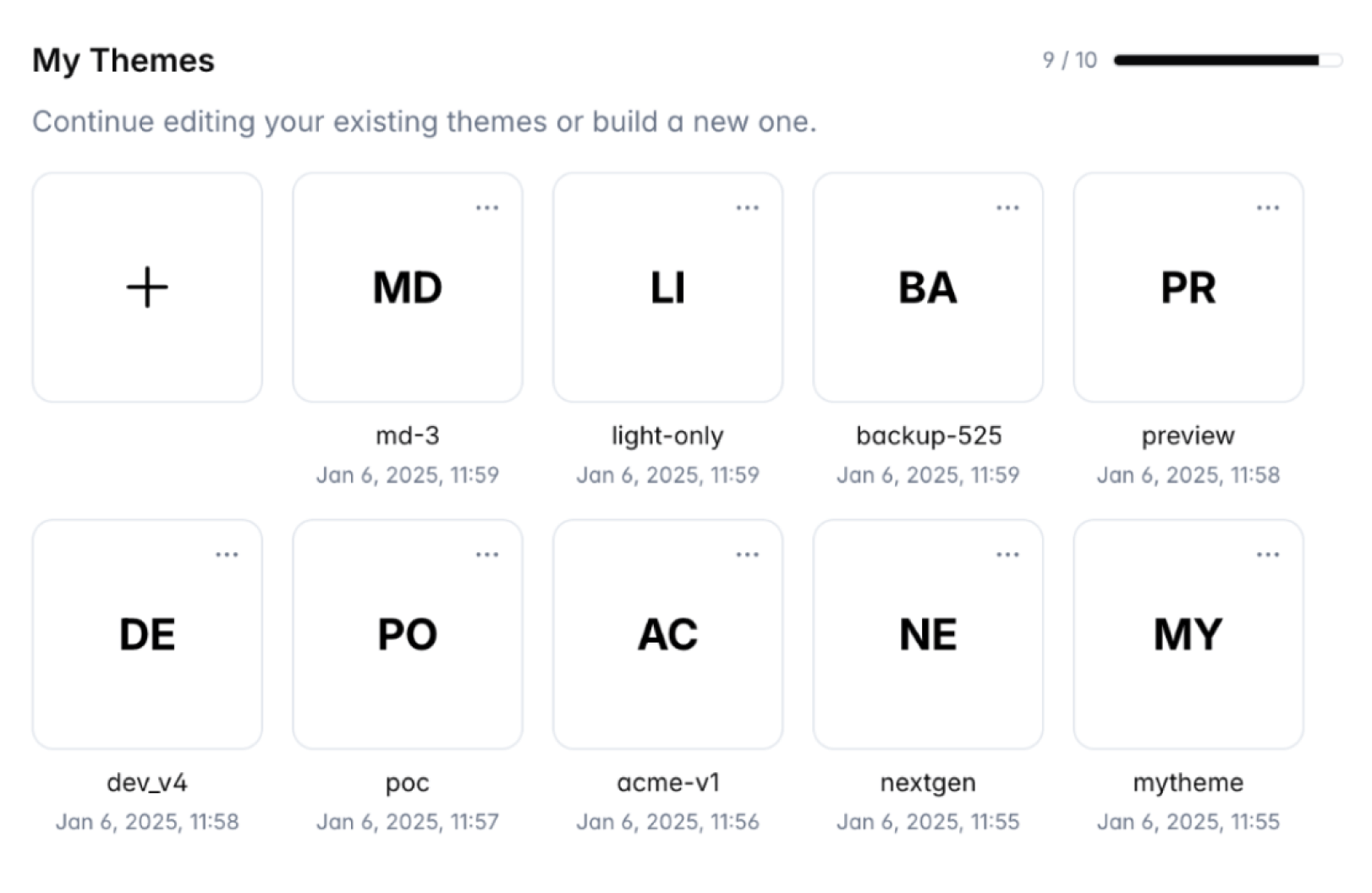
Dashboard #
Dashboard is the entry point of the designer. The license key can be configured at this view before getting started with the full set of features. In the My Themes section, you're able to create a theme, and manage existing themes. A theme can be renamed, duplicated and downloaded using the button.
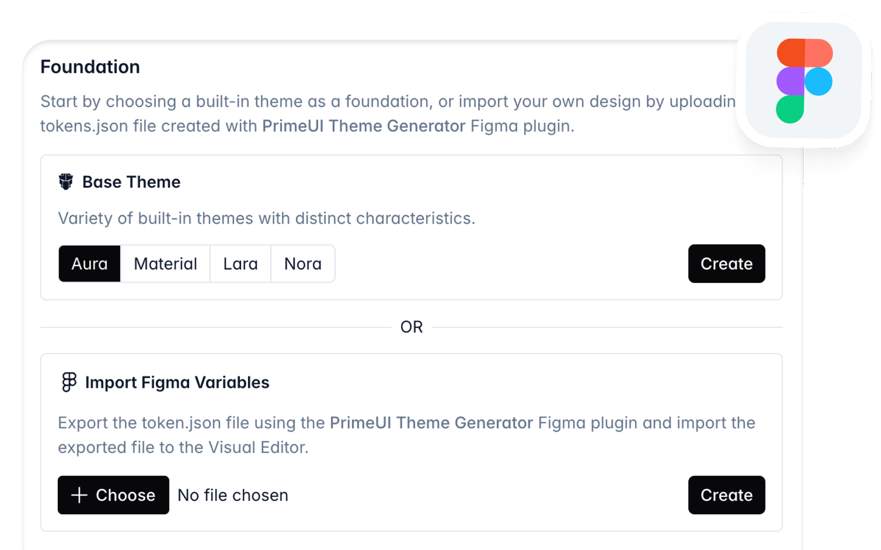
Create Theme #
A theme can be initiated from one of the built-in themes or from Figma UI Kit.
Base #
In the new theme section, all of the built-in themes are available to use as the base. These are; Aura, Material, Lara and Nora. Each have their own characteristics, and it is recommended to choose the one that best suits your requirements.
Figma #
For teams with UI designers, we recommend using PrimeOne Figma UI Kit for the design phase and utilizing the Theme Designer service to automate code generation during handoff. This workflow eliminates manual design-to-code translation, reducing implementation time and ensuring consistency between design and production.
UI Kit v4
Automated FlowRecommended approach is using the PrimeUI Theme Generator Figma plugin which provides built-in synchronization capabilities that automate the theme generation process. Visit the plugin website to learn more about this workflow.
Manual FlowInstead of generating themes directly from Figma using the plugin, for quick prototyping purposes, you may also choose to use to manually export a tokens json file and then upload it to the Theme Designer. Note that, this flow would get tedious and repetitive in active development cycles when compared to an automated flow.
Open the PrimeOne UI Kit in which you've modified tokens. In the PrimeUI Theme Generator plugin, click the Export option to export all variable collections.
When creating a new theme at Theme Designer, choose the Import Figma Variables option and import the json file.
UI Kit v3 (Deprecated)
CI PipelineRecommended approach is setting up the CI Pipeline flow as manually exporting the tokens file from Figma and uploading it to the online designer tool may quickly become tedious in active development cycles. As a solution, theme designer provides a remote API that can be integrated into your flow. Visit the CI Pipeline documentation for comprehensive information and examples for GitHub, GitLab and BitBucket.
Manual FlowInstead of setting a CI pipeline, for quick prototyping purposes, you may also choose to use to manually export a tokens json file and then upload it to the designer. Note that, this flow would get tedious and repetitive in active development cycles when compared to an automated CI pipeline.
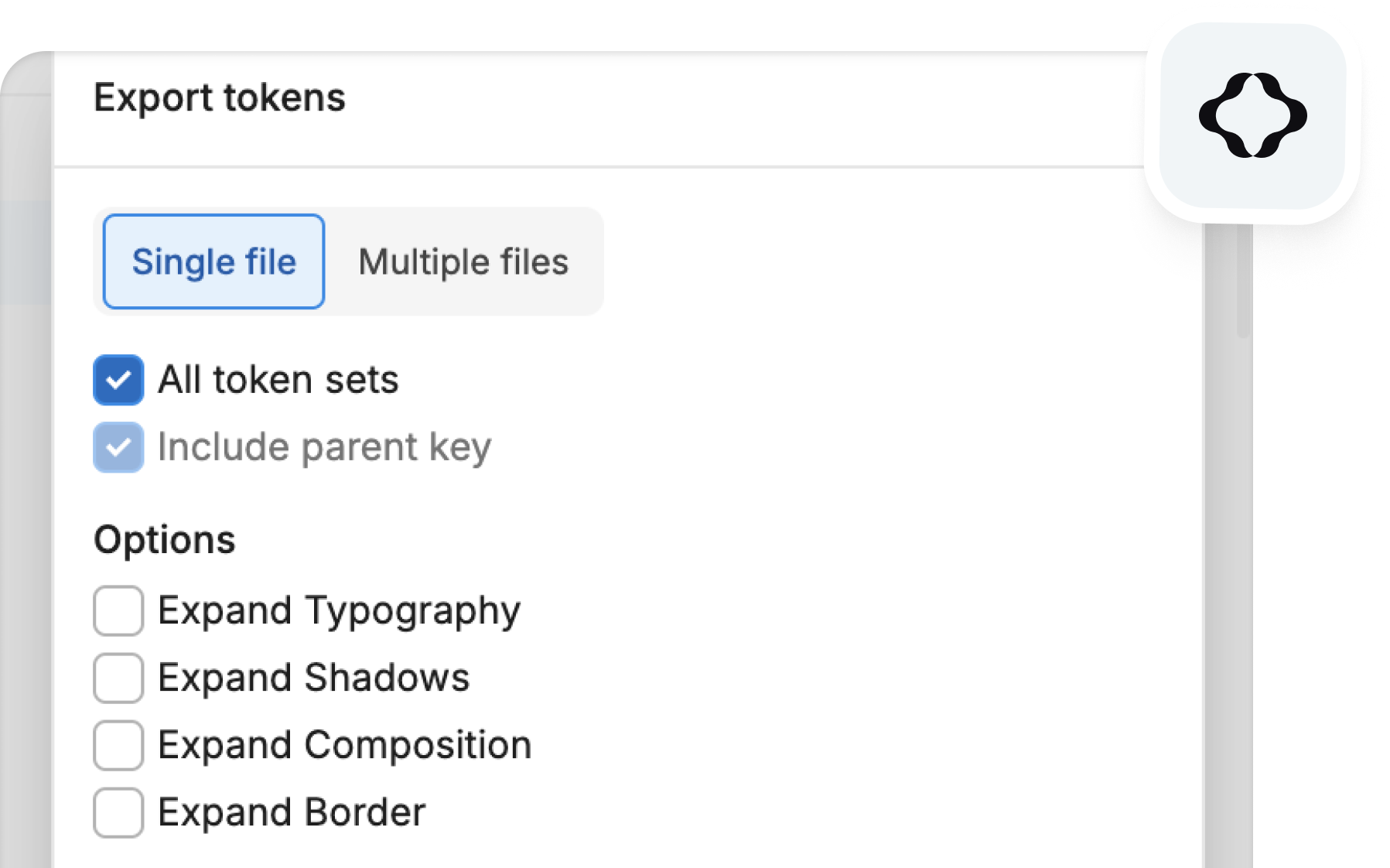
Open the PrimeOne UI Kit in which you've modified tokens. In the Tokens Studio plugin, navigate to the Tools menu and select Export to file/folder. When the Export tokens modal appears, make sure the Single file tab is selected. Check the All tokens sets option, then click Export.
In case you utilize custom tokens, create a new token set named custom and define your tokens under this set to make sure they are also exported to the theme code.
When creating a new theme at Theme Designer, choose the Import Figma Variables option and import the json file.
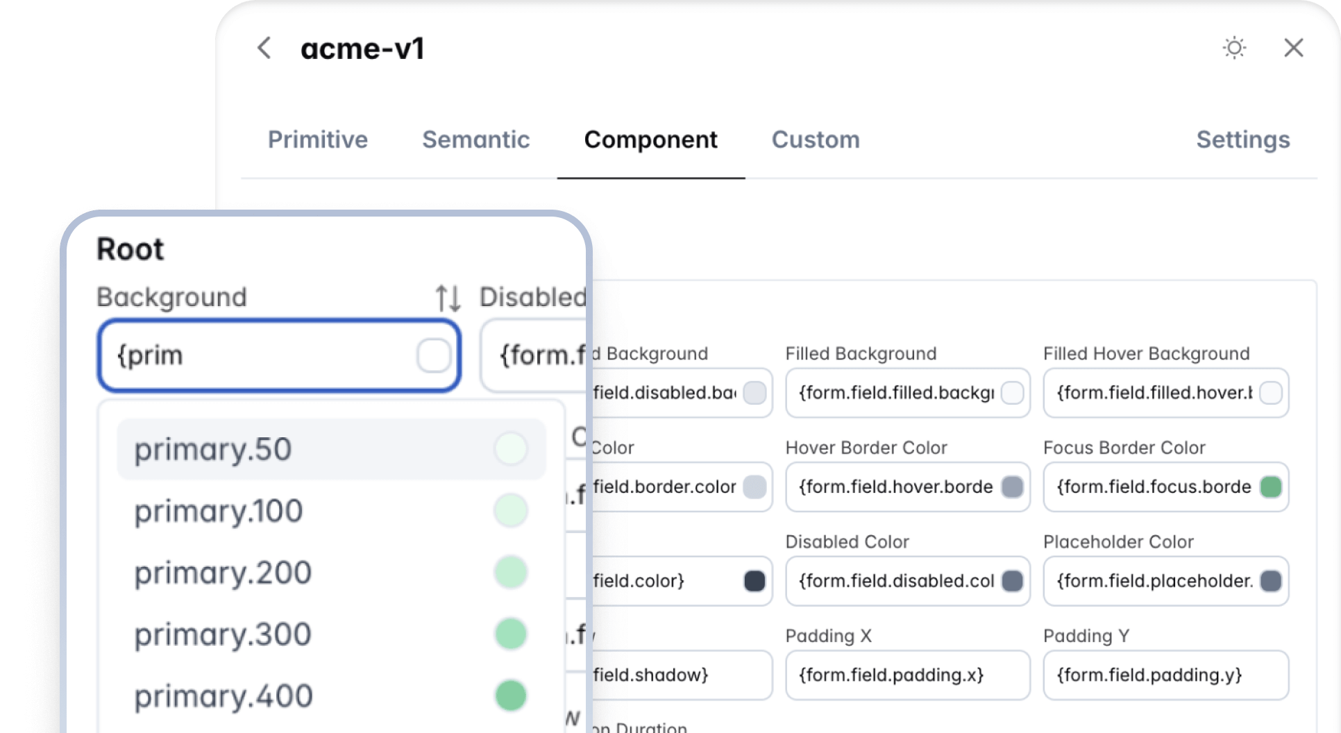
Editor #
Token Collections #
The theming architecture is based on primitive, semantic and components tokens. The visual editor, displays a dedicated section for each collection. For basic purposes such as customizing the primary and surface colors, primitive and semantic sections would be more than enough. The component tokens are displayed per route so navigate to the component page first to view the tokens of the specific component.
Custom Tokens #
Custom tokens allow bringing in your own design tokens to the theme to go beyond the built-in ones. A design token requires a name and a value where the value can be a static value like a color or another token. The name of the token should be a dot seperated lowercase value e.g. accent.color. For example, a custom token name can be defined as accent.color and the value can either be a value like #eab308 or another token such as {yellow.50}. Custom tokens can also refer to each other, e.g. selection.background custom token can define {accent.color} as a value.
If you have created a theme from Figma, use the name custom as the name of your token set group. This keyword is special since the import tool will populate the custom tokens using this set in tokens json file.
Intelligent Completion #
The editor is packed with features for improved user experience. The input fields in the editor are capable of displaying a color preview when the value is a color, and beginning the value with a curly brace opens up the autocompletion feature to list the available tokens to choose from. The pi-sort-alt symbol over the input, transfers the token between the common tokens and color scheme specific tokens so that you are able to define tokens based on light and dark mode as well.
Typography #
The components are not opinionated about the typography. Important properties such as the font family, font size, and line-height do not have design tokens since they can be inherited from the document. For preview purposes, the settings tab displays options to customize the base font and the font family of the document. These values are not available in the generated theme and need to be applied to your application at the document level.
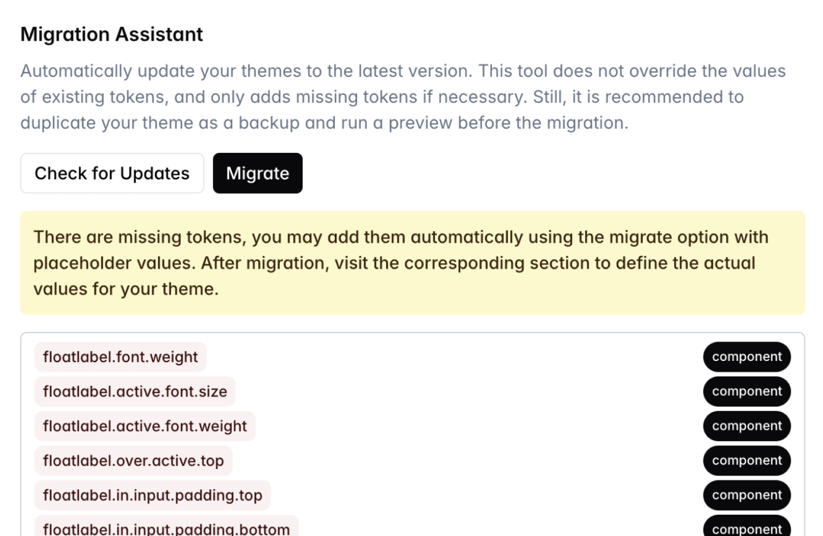
Migration Assistant #
Prime UI libraries continue to evolve with each version. New tokens are likely to be added with each major release, in order to keep your themes up to date the migration assistant is available featuring automated migration. The Check for Updates option initially scans a theme for any missing tokens. This tool does not override the values of existing tokens, and only adds missing tokens if necessary. Still, it is recommended to duplicate your theme as a backup and run a preview before the migration. Depending on the result, you may choose to proceed with the migration process. In case there are missing tokens, your theme would receive them with placeholder values so it is recommended to take a note of them before migration and then visit the components to replace the placeholder values with actual values of your choice. These types of newly added tokens would be highlighed in Editor.
Limitations #
Current known technical limitations are listed at this section.
- The border width token in Figma does not support multiple values, related issue.