Introduction
Next-generation UI Component suite for Vue.
Overview #
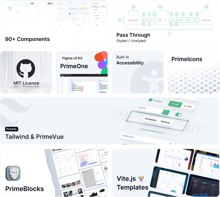
PrimeVue is a complete UI suite for Vue.js consisting of a rich set of UI components, icons, blocks, and application templates. The project's primary goal is to boost developer productivity by offering reusable solutions that are easy to tune and customize as an in-house library.
The project has been created by PrimeTek a world-renowned vendor of popular UI Component suites, including PrimeFaces, PrimeNG, and PrimeReact. All the members in our team are full time employees of PrimeTek who share the same passion and vision for open source to create awesome UI libraries. Depending on a 3rd party library may introduce risks if the library maintainers decide not to work on the project, however, this is not the case with PrimeVue as the track record of PrimeTek shows. For example, PrimeFaces has been maintained actively since 2008.
Theming #
PrimeVue can be styled in two modes; styled or unstyled. Styled mode is based on pre-skinned components with opinionated theme variants of PrimeOne design like Aura, Lara or Nora presets. Unstyled mode on the other hand, leaves the styling to you while implementing the functionality and accessibility. Unstyled mode provides full control over the styling with no boundaries by implementing a pluggable architecture to utilize CSS libraries like Tailwind CSS, Bootstrap, Bulma or your own custom CSS. We've even further built the Volt UI library that styles the components with utility classes of Tailwind. This design is future proof as PrimeVue can be styled with any CSS library without actually depending on it in its core.
Pass Through #
PassThrough is an innovative API to provide access to the internal DOM elements to add arbitrary attributes. In general, traditional UI component libraries encapsulate UI and logic with limited APIs that makes the developers dependant on the library maintainer to extend this API by adding new props or events. With Pass Through this limitation has been eliminated since, you'll be able to access the internal of the components to add events and attributes. Some common use-cases are adding test attributes, additional aria attributes, custom events and styling.
Accessibility #
PrimeVue has WCAG 2.1 AA level compliance; each component has a dedicated accessibility section to document several aspects, including keyboard and screen reader support. Through communication channels such as GitHub or Discord, numerous accessibility experts worldwide continue to provide constant feedback to improve the accessibility features further. View the accessibility guide to learn more.
Add-Ons #
PrimeVue does not require financial sponsorships from its community; instead, to be backed by a solid financial foundation, optional add-ons are offered. These include a Figma UI Kit, premium application templates, and reusable UI blocks called PrimeBlocks. The add-ons are optional and there is no paywall when using PrimeVue.
