Tailwind CSS
Integration between PrimeVue and Tailwind CSS both in styled and unstyled modes.
Overview #
Tailwind CSS is a popular CSS framework based on a utility-first design. The core provides flexible CSS classes with predefined CSS rules to build your own UI elements. For example, instead of an opinionated btn class as in Bootstrap, Tailwind offers primitive classes like bg-blue-500, rounded and p-4 to apply a button.
Tailwind is an outstanding CSS library, however it lacks a true comprehensive UI suite when combined with Vue.js, this is where PrimeVue comes in by providing a wide range of highly accessible and feature rich UI component library. The core of PrimeVue does not depend on Tailwind CSS, instead we provide the necessary integration points such as the primeui tailwind plugin or a spin-off UI library called Volt based on unstyled PrimeVue.
Tailwind CSS and PrimeVue can be used together via two main approaches to choose from. First approach is using Tailwind CSS around the styled PrimeVue components as demonstrated in the samples section below. The second alternative approach takes the integration a step further by replacing the default design token based styled mode with the unstyled mode and utilizing Tailwind CSS within the component internals via pass-through feature. A spin-off library from the PrimeTek UI ecosystem has been created based on this advanced integration called VOLT.
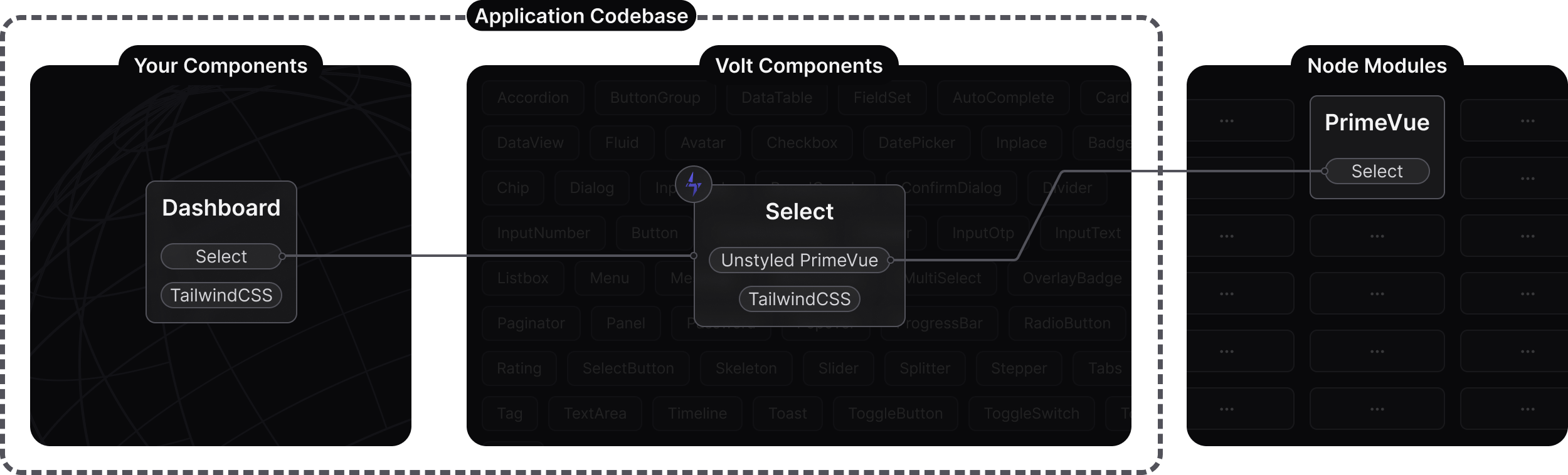
Volt UI #
Volt is an open source UI component library implemented with the Unstyled PrimeVue components and Tailwind CSS. Volt follows the Code Ownership model where the components live in your application code base as your own UI library rather than imported from node_modules as a 3rd party. Main benefit of this approach is full control over styling and ease of customization. Internally a Volt component wraps its PrimeVue counterpart, removes the default design token based theming and applies Tailwind utility classes via the pass through attributes feature. Volt components are designed to be customized with Tailwind CSS and do not require separate updates. They serve as wrappers around PrimeVue components, so maintenance is handled simply by updating the PrimeVue version.
Plugin #
The tailwindcss-primeui is an official plugin by PrimeTek to provide first class integration between a Prime UI library like PrimeVue and Tailwind CSS. It is designed to work both in styled and unstyled modes. In styled mode, for instance the semantic colors such as primary and surfaces are provided as Tailwind utilities e.g. bg-primary, text-surface-500, text-muted-color.
If you haven't already done so, start by integrating Tailwind into your project. Detailed steps for this process can be found in the Tailwind documentation. After successfully installing Tailwind, proceed with the installation of the PrimeUI plugin. This single npm package comes with two libraries: the CSS version is compatible with Tailwind v4, while the JS version is designed for Tailwind v3.
npm i tailwindcss-primeui
Tailwind v4
In the CSS file that contains the tailwindcss import, add the tailwindcss-primeui import as well.
@import "tailwindcss";
@import "tailwindcss-primeui";
Tailwind v3
Use the plugins option in your Tailwind config file to configure the plugin.
// tailwind.config.js
import PrimeUI from 'tailwindcss-primeui';

export default {
    // ...
    plugins: [PrimeUI]
};
Extensions #
The plugin extends the default configuration with a new set of utilities whose values are derived from the PrimeVue theme in use. All variants and breakpoints are supported e.g. dark:sm:hover:bg-primary.
Color Palette
| Class | Property |
|---|---|
| primary-[50-950] | Primary color palette. |
| surface-[0-950] | Surface color palette. |
| primary | Default primary color. |
| primary-contrast | Default primary contrast color. |
| primary-emphasis | Default primary emphasis color. |
| border-surface | Content border color. |
| bg-emphasis | Emphasis background e.g. hovered element. |
| bg-highlight | Highlight background. |
| bg-highlight-emphasis | Highlight background with emphasis. |
| rounded-border | Border radius. |
| text-color | Text color with emphasis. |
| text-color-emphasis | Default primary emphasis color. |
| text-muted-color | Secondary text color. |
| text-muted-color-emphasis | Secondary text color with emphasis. |
Dark Mode #
In styled mode, PrimeVue uses the system as the default darkModeSelector in theme configuration. If you have a dark mode switch in your application, ensure that darkModeSelector is aligned with the Tailwind dark variant for seamless integration. Note that, this particular configuration isn't required if you're utilizing the default system color scheme.
Suppose that, the darkModeSelector is set as my-app-dark in PrimeVue.
import PrimeVue from 'primevue/config';
import Aura from '@primeuix/themes/aura';

const app = createApp(App);

app.use(PrimeVue, {
    theme: {
        preset: Aura,
        options: {
            darkModeSelector: '.my-app-dark',
        }
    }
 });
Tailwind v4
Add a custom variant for dark with a custom selector.
@import "tailwindcss";
@import "tailwindcss-primeui";
@custom-variant dark (&:where(.my-app-dark, .my-app-dark *));     //dark mode configuration
Tailwind v3
Use the plugins option in your Tailwind config file to configure the plugin.
// tailwind.config.js
import PrimeUI from 'tailwindcss-primeui';

export default {
    darkMode: ['selector', '[class~="my-app-dark"]'],           //dark mode configuration
    plugins: [PrimeUI]
};
Override #
Tailwind utilities may not be able to override the default styling of components due to css specificity, there are two possible solutions; Important and CSS Layer.
Important
Use the ! as a prefix to enforce the styling. This is not the recommend approach, and should be used as last resort to avoid adding unnecessary style classes to your bundle.
Tailwind v4
<InputText placeholder="Overridden" class="p-8!" />
Tailwind v3
<InputText placeholder="Overridden" class="!p-8" />
CSS Layer
CSS Layer provides control over the css specificity so that Tailwind utilities can safely override components.
Tailwind v4
Ensure primevue layer is after theme and base, but before the other Tailwind layers such as utilities.
import PrimeVue from 'primevue/config';
import Aura from '@primeuix/themes/aura';

const app = createApp(App);

app.use(PrimeVue, {
    theme: {
        preset: Aura,
        options: {
            cssLayer: {
                name: 'primevue',
                order: 'theme, base, primevue'
            }
        }
    }
 });
No change in the CSS configuration is required.
@import "tailwindcss";
@import "tailwindcss-primeui";
Tailwind v3
The primevue layer should be between base and utilities.
import PrimeVue from 'primevue/config';
import Aura from '@primeuix/themes/aura';

const app = createApp(App);

app.use(PrimeVue, {
    theme: {
        preset: Aura,
        options: {
            cssLayer: {
                name: 'primevue',
                order: 'tailwind-base, primevue, tailwind-utilities'
            }
        }
    }
 });
Tailwind v3 does not use native layer so needs to be defined with CSS.
@layer tailwind-base, primevue, tailwind-utilities;

@layer tailwind-base {
  @tailwind base;
}

@layer tailwind-utilities {
  @tailwind components;
  @tailwind utilities;
}
Samples #
Example uses cases with PrimeVue and Tailwind CSS.
Color Palette #
PrimeVue color palette as utility classes.
- primary050100200300400500600700800900950
- surface050100200300400500600700800900950
<div class="flex flex-col gap-12">
    <div class="flex gap-6 flex-wrap">
        <div class="rounded-border p-4 border border-transparent flex items-center justify-center bg-primary hover:bg-primary-emphasis text-primary-contrast font-medium flex-auto transition-colors">primary</div>
        <div class="rounded-border p-4 border border-transparent flex items-center justify-center bg-highlight hover:bg-highlight-emphasis font-medium flex-auto transition-colors">highlight</div>
        <div class="rounded-border p-4 border border-surface flex items-center justify-center text-muted-color hover:text-color hover:bg-emphasis font-medium flex-auto transition-colors">box</div>
    </div>
</div>
Form #
Using Tailwind utilities for the responsive layout of a form with PrimeVue components.
<div class="flex flex-col gap-6 w-full sm:w-auto">
    <div class="flex flex-col sm:flex-row sm:items-center gap-6">
        <div class="flex-auto">
            <label for="firstname" class="block font-semibold mb-2">Firstname</label>
            <InputText id="firstname" class="w-full" />
        </div>
        <div class="flex-auto">
            <label for="lastname" class="block font-semibold mb-2">Lastname</label>
            <InputText id="lastname" class="w-full" />
        </div>
    </div>
    <div class="flex flex-col sm:flex-row sm:items-center gap-6">
        <div class="flex-1">
            <label for="date" class="block font-semibold mb-2">Date</label>
            <DatePicker inputId="date" class="w-full" />
        </div>
        <div class="flex-1">
            <label for="country" class="block font-semibold mb-2">Country</label>
            <Select v-model="selectedCountry" inputId="country" :options="countries" optionLabel="name" placeholder="Select a Country" class="w-full">
                <template #value="slotProps">
                    <div v-if="slotProps.value" class="flex items-center">
                        <img :alt="slotProps.value.label" src="https://primefaces.org/cdn/primevue/images/flag/flag_placeholder.png" :class="`mr-2 flag flag-${slotProps.value.code.toLowerCase()}`" style="width: 18px" />
                        <div>{{ slotProps.value.name }}</div>
                    </div>
                    <span v-else>
                        {{ slotProps.placeholder }}
                    </span>
                </template>
                <template #option="slotProps">
                    <div class="flex items-center">
                        <img :alt="slotProps.option.label" src="https://primefaces.org/cdn/primevue/images/flag/flag_placeholder.png" :class="`mr-2 flag flag-${slotProps.option.code.toLowerCase()}`" style="width: 18px" />
                        <div>{{ slotProps.option.name }}</div>
                    </div>
                </template>
            </Select>
        </div>
    </div>
    <div class="flex-auto">
        <label for="message" class="block font-semibold mb-2">Message</label>
        <Textarea id="message" class="w-full" rows="4" />
    </div>
</div>
Headless #
A headless PrimeVue dialog with a custom UI.
<Button label="Login" icon="pi pi-user" @click="visible = true" />

<Dialog v-model:visible="visible" pt:root:class="!border-0 !bg-transparent" pt:mask:class="backdrop-blur-sm">
    <template #container="{ closeCallback }">
        <div class="flex flex-col px-8 py-8 gap-6 rounded-2xl" style="background-image: radial-gradient(circle at left top, var(--p-primary-400), var(--p-primary-700))">
            <svg width="35" height="40" viewBox="0 0 35 40" fill="none" xmlns="http://www.w3.org/2000/svg" class="block mx-auto">
                <path
                    d="M25.87 18.05L23.16 17.45L25.27 20.46V29.78L32.49 23.76V13.53L29.18 14.73L25.87 18.04V18.05ZM25.27 35.49L29.18 31.58V27.67L25.27 30.98V35.49ZM20.16 17.14H20.03H20.17H20.16ZM30.1 5.19L34.89 4.81L33.08 12.33L24.1 15.67L30.08 5.2L30.1 5.19ZM5.72 14.74L2.41 13.54V23.77L9.63 29.79V20.47L11.74 17.46L9.03 18.06L5.72 14.75V14.74ZM9.63 30.98L5.72 27.67V31.58L9.63 35.49V30.98ZM4.8 5.2L10.78 15.67L1.81 12.33L0 4.81L4.79 5.19L4.8 5.2ZM24.37 21.05V34.59L22.56 37.29L20.46 39.4H14.44L12.34 37.29L10.53 34.59V21.05L12.42 18.23L17.45 26.8L22.48 18.23L24.37 21.05ZM22.85 0L22.57 0.69L17.45 13.08L12.33 0.69L12.05 0H22.85Z"
                    fill="var(--p-primary-700)"
                />
                <path
                    d="M30.69 4.21L24.37 4.81L22.57 0.69L22.86 0H26.48L30.69 4.21ZM23.75 5.67L22.66 3.08L18.05 14.24V17.14H19.7H20.03H20.16H20.2L24.1 15.7L30.11 5.19L23.75 5.67ZM4.21002 4.21L10.53 4.81L12.33 0.69L12.05 0H8.43002L4.22002 4.21H4.21002ZM21.9 17.4L20.6 18.2H14.3L13 17.4L12.4 18.2L12.42 18.23L17.45 26.8L22.48 18.23L22.5 18.2L21.9 17.4ZM4.79002 5.19L10.8 15.7L14.7 17.14H14.74H15.2H16.85V14.24L12.24 3.09L11.15 5.68L4.79002 5.2V5.19Z"
                    fill="var(--p-primary-200)"
                />
            </svg>
            <div class="inline-flex flex-col gap-2">
                <label for="username" class="text-primary-50 font-semibold">Username</label>
                <InputText id="username" class="!bg-white/20 !border-0 !p-4 !text-primary-50 w-80"></InputText>
            </div>
            <div class="inline-flex flex-col gap-2">
                <label for="password" class="text-primary-50 font-semibold">Password</label>
                <InputText id="password" class="!bg-white/20 !border-0 !p-4 !text-primary-50 w-80" type="password"></InputText>
            </div>
            <div class="flex items-center gap-4">
                <Button label="Cancel" @click="closeCallback" text class="!p-4 w-full !text-primary-50 !border !border-white/30 hover:!bg-white/10"></Button>
                <Button label="Sign-In" @click="closeCallback" text class="!p-4 w-full !text-primary-50 !border !border-white/30 hover:!bg-white/10"></Button>
            </div>
        </div>
    </template>
</Dialog>
Starter #
The Tailwind v4 and PrimeVue starter example is available to demonstrate the integration setup with an example dashboard.
Animations #
The plugin also adds extended animation utilities that can be used with the styleclass and animateonscroll directives.
<Select v-model="animation" :options="animations" placeholder="Select One" class="w-full sm:w-44" />
<div class="py-8 overflow-hidden">
    <div :class="`rounded-border bg-primary w-16 h-16 mx-auto animate-${animation} animate-once animate-duration-1000`"></div>
</div>
Enter and Leave
In addition to the prebuilt animations, you may also build your own declaratively using the animate-enter and animate-leave along with the opacity, rotate, scale and translate parameters. These animations work perfectly with the AnimateOnScroll directive, visit this directive for various examples.
Animations
| Class | Property |
|---|---|
| animate-enter | animation-name: enter; --p-enter-opacity: initial; --p-enter-scale: initial; --p-enter-rotate: initial; --p-enter-translate-x: initial; --p-enter-translate-y: initial; |
| animate-leave | animation-name: leave; --p-leave-opacity: initial; --p-leave-scale: initial; --p-leave-rotate: initial; --p-leave-translate-x: initial; --p-leave-translate-y: initial; |
| animate-fadein | fadein 0.15s linear |
| animate-fadeout | fadeout 0.15s linear |
| animate-slidedown | slidedown 0.45s ease-in-out |
| animate-slideup | slideup 0.45s cubic-bezier(0, 1, 0, 1) |
| animate-scalein | scalein 0.15s linear |
| animate-fadeinleft | fadeinleft 0.15s linear |
| animate-fadeoutleft | fadeoutleft 0.15s linear |
| animate-fadeinright | fadeinright 0.15s linear |
| animate-fadeoutright | fadeoutright 0.15s linear |
| animate-fadeinup | fadeinup 0.15s linear |
| animate-fadeoutup | fadeoutup 0.15s linear |
| animate-fadeindown | fadeindown 0.15s linear |
| animate-fadeoutup | fadeoutup 0.15s linear |
| animate-width | width 0.15s linear |
| animate-flip | flip 0.15s linear |
| animate-flipup | flipup 0.15s linear |
| animate-flipleft | fadein 0.15s linear |
| animate-flipright | flipright 0.15s linear |
| animate-zoomin | zoomin 0.15s linear |
| animate-zoomindown | zoomindown 0.15s linear |
| animate-zoominleft | zoominleft 0.15s linear |
| animate-zoominright | zoominright 0.15s linear |
| animate-zoominup | zoominup 0.15s linear |
Animation Duration
| Class | Property |
|---|---|
| animate-duration-0 | animation-duration: 0s |
| animate-duration-75 | animation-duration: 75ms |
| animate-duration-100 | animation-duration: 100ms |
| animate-duration-200 | animation-duration: 200ms |
| animate-duration-300 | animation-duration: 300ms |
| animate-duration-400 | animation-duration: 400ms |
| animate-duration-500 | animation-duration: 500ms |
| animate-duration-700 | animation-duration: 700ms |
| animate-duration-1000 | animation-duration: 1000ms |
| animate-duration-2000 | animation-duration: 2000ms |
| animate-duration-3000 | animation-duration: 300ms |
| animate-duration-[value] | animation-duration: value |
Animation Delay
| Class | Property |
|---|---|
| animate-delay-none | animation-duration: 0s |
| animate-delay-75 | animation-delay: 75ms |
| animate-delay-100 | animation-delay: 100ms |
| animate-delay-150 | animation-delay: 150ms |
| animate-delay-200 | animation-delay: 200ms |
| animate-delay-300 | animation-delay: 300ms |
| animate-delay-400 | animation-delay: 400ms |
| animate-delay-500 | animation-delay: 500ms |
| animate-delay-700 | animation-delay: 700ms |
| animate-delay-1000 | animation-delay: 1000ms |
Iteration Count
| Class | Property |
|---|---|
| animate-infinite | animation-iteration-count: infinite |
| animate-once | animation-iteration-count: 1 |
| animate-twice | animation-iteration-count: 2 |
Direction
| Class | Property |
|---|---|
| animate-normal | animation-direction: normal |
| animate-reverse | animation-direction: reverse |
| animate-alternate | animation-direction: alternate |
| animate-alternate-reverse | animation-direction: alternate-reverse |
Timing Function
| Class | Property |
|---|---|
| animate-ease-linear | animation-timing-function: linear |
| animate-ease-in | animation-timing-function: cubic-bezier(0.4, 0, 1, 1) |
| animate-ease-out | animation-timing-function: cubic-bezier(0, 0, 0.2, 1) |
| animate-ease-in-out | animation-timing-function: cubic-bezier(0.4, 0, 0.2, 1) |
Fill Mode
| Class | Property |
|---|---|
| animate-fill-none | animation-fill-mode: normal |
| animate-fill-forwards | animation-fill-mode: forwards |
| animate-fill-backwards | animation-fill-mode: backwards |
| animate-fill-both | animation-fill-mode: both |
Play State
| Class | Property |
|---|---|
| animate-running | animation-play-state: running |
| animate-paused | animation-play-state: paused |
Backface Visibility State
| Class | Property |
|---|---|
| backface-visible | backface-visibility: visible |
| backface-hidden | backface-visibility: hidden |
Fade In and Out
Values are derived from the Tailwind CSS opacity e.g. fade-in-50 and fade-out-20. Arbitrary values such as fade-in-[15] are also supported.
| Class | Property |
|---|---|
| fade-in-{value} | --p-enter-opacity: {value} |
| fade-out-{value} | --p-leave-opacity: {value} |
Zoom In and Out
Values are derived from the Tailwind CSS scale e.g. zoom-in-50 and zoom-out-75. Arbitrary values such as zoom-in-[0.8] are also supported.
| Class | Property |
|---|---|
| zoom-in-{value} | --p-enter-scale: {value} |
| zoom-out-{value} | --p-leave-scale: {value} |
Spin In and Out
Values are derived from the Tailwind CSS rotate e.g. spin-in-45 and spin-out-90. Arbitrary values such as spin-in-[60deg] are also supported.
| Class | Property |
|---|---|
| spin-in-{value} | --p-enter-rotate: {value} |
| spin-out-{value} | --p-leave-rotate: {value} |
Slide In and Out
Values are derived from the Tailwind CSS translate e.g. slide-in-from-t-50 and slide-out-to-l-8. Arbitrary values such as slide-in-from-b-[8px] are also supported.
| Class | Property |
|---|---|
| slide-in-from-t-{value} | --p-enter-translate-y: -{value} |
| slide-in-from-b-{value} | --p-enter-translate-y: {value} |
| slide-in-from-l-{value} | --p-enter-translate-x: -{value} |
| slide-in-from-r-{value} | --p-enter-translate-x: {value} |
| slide-out-to-t-{value} | --p-leave-translate-y: -{value} |
| slide-out-to-b-{value} | --p-leave-translate-y: {value} |
| slide-out-to-l-{value} | --p-leave-translate-x: -{value} |
| slide-out-to-r-{value} | --p-leave-translate-x: {value} |