PrimeOne Guide | 4.0
PrimeOne is a strong UI component library gets even better with a great Figma UI Kit. That's what PrimeOne is PrimeTek's official Figma UI Kit, built to work seamlessly with the Prime UI Suites.
Overview #
PrimeOne is the official Figma library of UI components designed to match the implementations in the Prime UI Suites. The current iteration of PrimeOne is structured around the Aura Light and Aura Dark themes.
Important Notice #
Starting from PrimeOne UI Kit version 4.0, the Tokens Studio plugin is no longer used. We've fully migrated to Figma's native variable features, which now power the system. If you prefer to continue working with Tokens Studio, please use PrimeOne UI Kit version 3.2, which still supports the plugin.
Resources #
PrimeOne for Figma takes full advantage of powerful Figma features such as components, variants, auto layout, styles, prototypes, and variables.
If you're new to Figma or want to get the most out of PrimeOne, we recommend exploring the following resources:
- Variables - PrimeOne uses Figma Variables for design token management. Visit the official docs to understand how it works and how to use it effectively.
- Figma's Best Practice Guides - Learn how to work efficiently with components, variants, and layouts.
- Figma's Official YouTube Channel - Tutorials and feature walkthroughs from the Figma team.
- Figmalion Newsletter - Stay updated with curated insights from the Figma community.
Installation #
Importing #
- Download the latest .fig UI Kit - From your PrimeStore panel, download the latest PrimeOne package. The archive contains the .fig UI Kit.
- Open Figma in Google Chrome - Launch Figma in Chrome (or another supported browser). Avoid using the Desktop app for this import. It's more reliable in-browser.
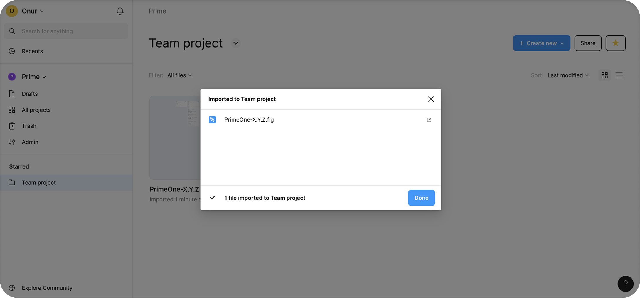
- Import into your Team project - Navigate to the Teams section in the left sidebar. Select your Team project where you want PrimeOne. Drag and drop the .fig file into the project folder in the browser UI. Figma will upload it, showing a new file card once complete.
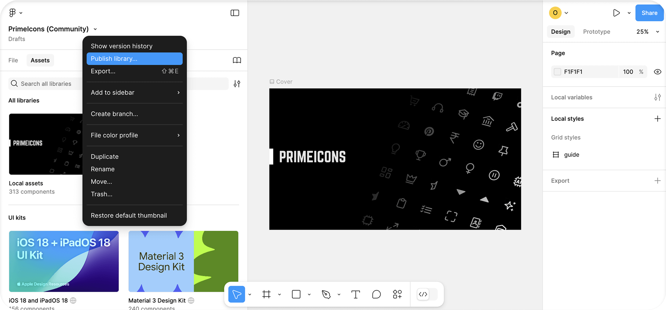
Publishing #
To make PrimeOne available as a shared library:
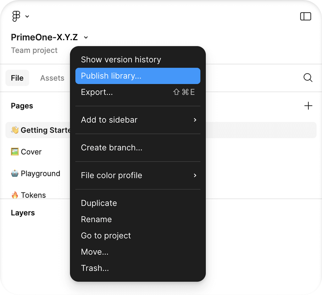
- Open the imported PrimeOne .fig file.
- Go to Assets Manage Libraries
- Click "Publish..." to share PrimeOne with your team, then confirm by clicking the "Publish" button in the modal.
Enabling #
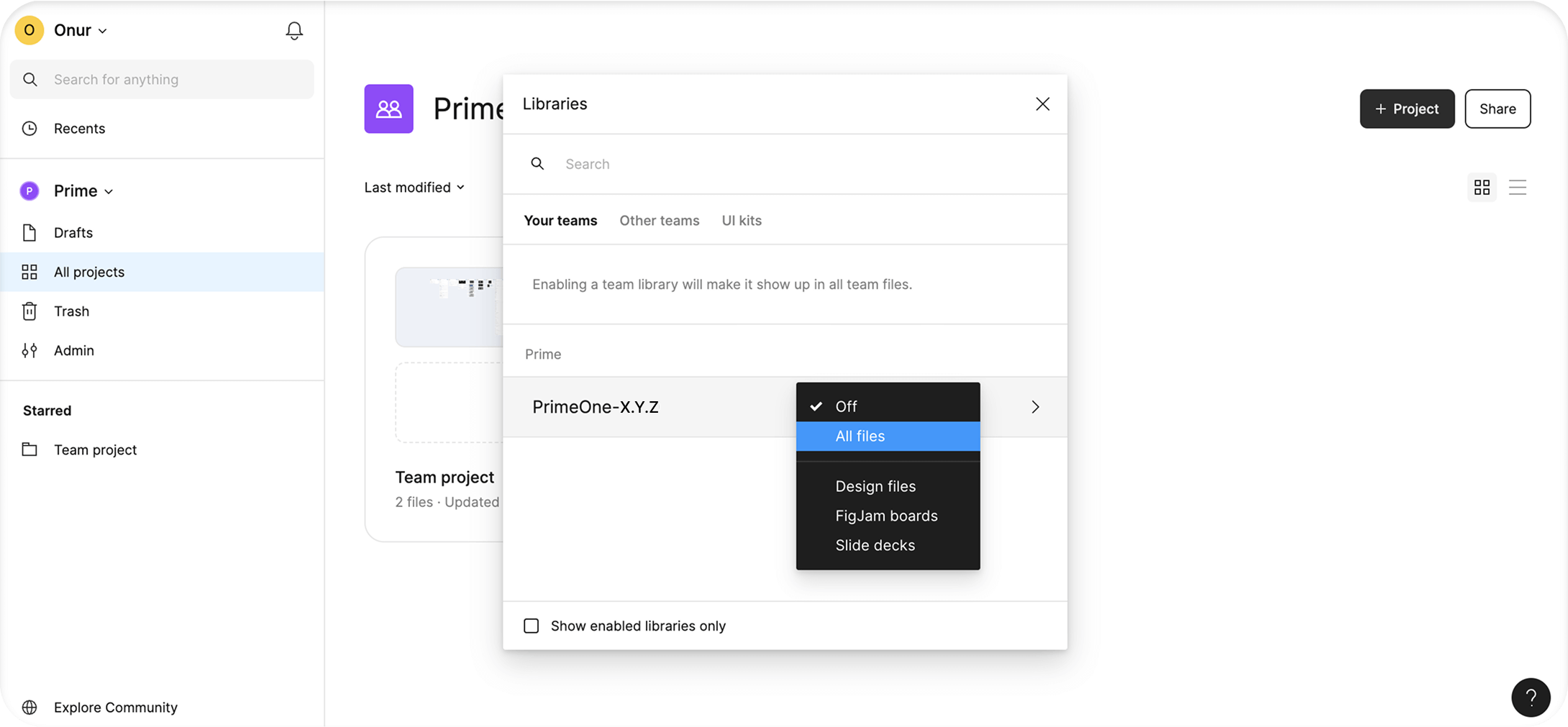
If you want to enable PrimeOne across all files in your team, follow these steps:
- Navigate to All Projects from the Teams section.
- Go to View Settings View Team Libraries. You can find this option in the dropdown menu next to your team name.
- Toggle PrimeOne "On" to make it available globally.
Collections #
- Primitive
This collection contains the most foundational variables, such as base colors and border radius, elements that are considered “primitive” by nature.
- Semantic Common & Semantic Color Scheme
Includes essential system-wide variables like primary, surface, and other shared design values It also defines variables used across multiple component groups. For example, variables under form/field are referenced by component-level variables in InputText, MultiSelect, Checkbox, and other form components, enabling consistent styling across the board.
- Component Common & Component Color Scheme
These variables are defined specifically for each component to allow deep customization. While we've aimed to create dedicated variables for every component state, many of them still reference the semantic or primitive variables, allowing you to make global updates from a single place when needed.
- App
Variables in this collection are not part of the PrimeUIX system. They are intended for values defined in your own application. The same applies to variables used in our UI library showcases. For example, there is no dedicated font size variable in PrimeUIX because font styles are not part of the design system. UI components inherit their font settings from the application.
- Custom
If you're using the Figma to Theme feature and want your newly created custom variables to appear in your Theme Designer themes, place them in this collection. Even if you're not using the Theme Designer, we still recommend creating a separate collection — or using the existing “Custom” collection — for your own variables. Making changes to the default collections, especially deleting variables or altering reference values, can lead to inconsistencies with the library variables and cause additional work during development.
PrimeUI Figma Plugin #
PrimeUI Theme Generator Figma plugin is the official tool developed by PrimeTek that provides built-in synchronization capabilities to automate the theme code generation process. Visit the plugin website to learn more about this workflow.
Update PrimeOne #
When a new version of PrimeOne is released, follow the steps below to update your files:
- Download the latest version of PrimeOne from PrimeStore.
- Unzip the file and upload it to your Figma workspace.
- Publish the newly uploaded file as a library.
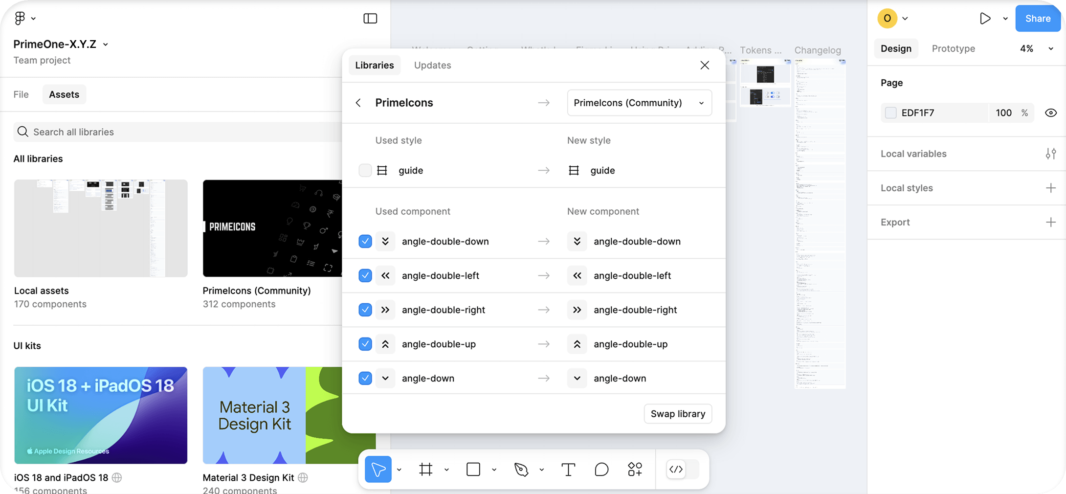
- In all consumer files, use Swap Library to point to the new version.
- Once the transition is complete, you can safely unpublish the old PrimeOne library
Before each update, it's a good idea to review the Changelog on the Get Started page of the PrimeOne Figma file.
Keep in mind that while Swap Library will update most components, any customized components may require manual review and adjustment.
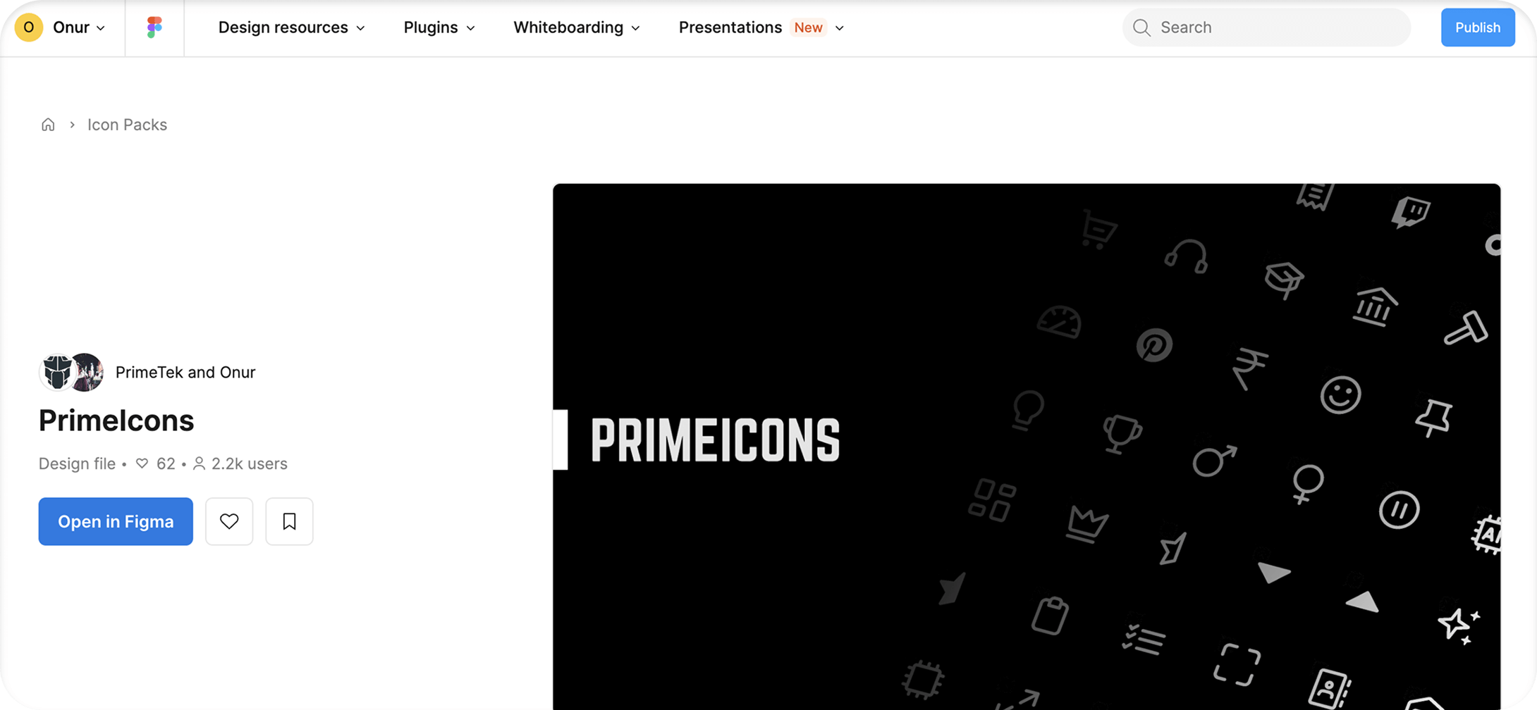
Adding PrimeIcons #
PrimeOne uses PrimeIcons, the official icon library by PrimeTek. To use it effectively within your design system, you need to add PrimeIcons to your Figma environment by following these steps:
Open the PrimeIcons file in Figma and move it to your team project.
Publish the PrimeIcons file and enable it for all team files in your Team Settings.
Return to your PrimeOne file. In the Libraries panel, click on the banner that says “Includes X missing libraries.”
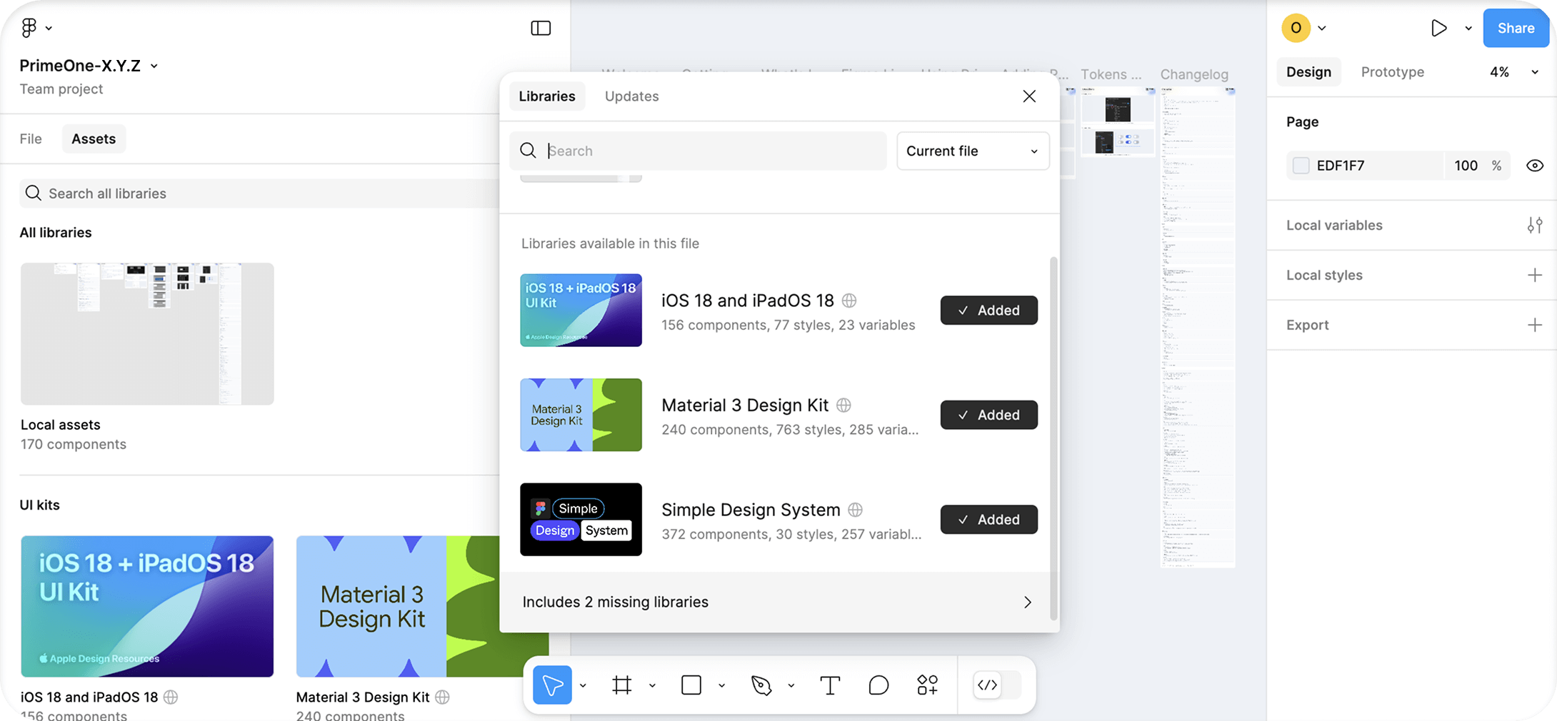
From the dropdown, select “PrimeIcons (Community)” and click the Swap Library button.
FAQ #
Usage #
- What should we do after purchasing? I can't publish the Preview file?
The Preview file is view-only, so it can't be published. To use the library, download the .fig file from PrimeStore and import it into your Figma workspace. Once imported, you'll be able to open the file and publish it as a library for use in your projects.
- How to change theme?
To enable theme switching in PrimeOne, you need to set up the Variable modes. Select the layers you want to switch between Light or Dark. Then, under Appearance, use the Apply variable modes icon to assign both the Semantic and Component modes to the target theme.
Components #
- How to change base font size?
The base font size used in PrimeOne is 14px. Similar to how rem works in CSS, this is controlled by the scale/* variables located under the "Primitive" collection in Variables.
When you change the values of these variables, all size calculations will adjust accordingly.
Note that not all variables in the library may be linked to scale/* variables. So it's essential to check components individually.
Updates #
- Will there be a completely new Figma file with each update, or will the current PrimeOne file be modified and versioned?
Each update will come as a new Figma file—an updated version of the previous one. You can seamlessly transition to the new version in your consumer files using Figma's Swap Library feature.
- Will the PrimeOne UI Kit stay in sync with ongoing updates to the Prime UI Libraries?
The PrimeOne UI Kit does not update in real time alongside the libraries. However, we regularly release updates to bridge the gap and ensure alignment with key changes.
- How will users receive new components when they're added?
New components will be included in future updates to the UI Kit. Please note that these updates may not coincide immediately with library changes and may take some time to roll out.
- How frequently is the PrimeOne UI Kit updated?
We don't follow a fixed release schedule. Updates are made as needed, based on significant changes or additions to the Prime UI libraries.
Roadmap #
- Are there plans to add a Tailwind theme to the UI Kit?
At this time, we do not plan to include Tailwind theme support in the Figma UI Kit.
Licence #
- Will purchasing a PrimeBlocks license include access to PrimeOne components?
No. The PrimeBlocks license does not grant access to the PrimeOne UI Kit. They are separate products with individual licenses.
Limitations #
Current known technical limitations are listed at this section.
- Multiple-value variables - Figma currently supports only a single value per variable. For this reason, multi-value tokens defined in PrimeUIX—such as padding or margin, which can contain multiple values—are represented in Figma as separate variables for each side (top/right/bottom/left) or axis (x/y), unlike the combined multi-value CSS definitions in PrimeUIX.
- Calculations - Since Figma does not yet allow calculations within variable definitions, values that rely on expressions like calc() cannot function dynamically. In these cases, any adjustments you make may require manual updates.
- Focus Rings - In Tokens Studio, focus rings could be positioned by calculating the outer stroke distance using expressions such as focus.ring.width + focus.ring.offset. Since Figma Variables do not support arithmetic operations, these calculations cannot be reproduced. As a result, focus ring width values are no longer dynamically linked and must be handled as static values.
- Color Mix - Figma Variables do not currently support color mix modifiers. Values in PrimeUIX that rely on color mixing have therefore been converted into raw hex values when brought into Figma Variables.
Support #
The community gathers on GitHub Discussions and Discord to ask questions, share ideas, and discuss the technology. For direct inquiries or suggestions, feel free to contact us at [email protected].